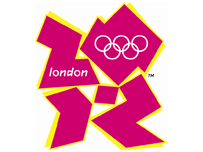
The new London 2012 Olympics logo looks like a car-crash. Which is, I suppose, somewhat appropriate. I can only assume that this was done deliberately to make the 2012 Olympics a laughing stock.
Hopefully someone from the IOC will see the logo, realise that we’re not taking this at all seriously and let some other city host the games instead of London.
Update: The BBC have published some alternative logos that have been sent in by readers. Can I just say that Sean Stayte (logo number 5) is a very naughty man. And that the editor who published that picture is either very naive or else has a keen grasp of internet memes.
Update: The dubious logo has been removed from that page. But the direct link still works.
Apparently this crap cost £400k. No wonder the games are so much over-budget if this is the kind of money they’re spending. It should have cost £1k absolute max for a logo, and even that’s a bit steep.Whoever approved this heap of junk needs taking off the job. It will have to be re-done.
Goatse 1 – London 2012 Olympics 0
Excellent prank, if you ask me. :-)
Urgh. I’d never heard of goatse.cx, but your post set me on a mission. From Google, to Wikipedia, to… bleurgh. I wish I’d never bothered!!!I know a graphic designer who did me a website logo for £50. Top notch as well. If Seb Coe wants his number I’ll gladly pass it on – I may even be able to arrange ‘mates rates’ if he’s a bit short of cash ;)